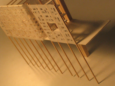
This is my essential plan which I think I will commit to and will readjust accordingly.
Pragmatically, and borrowing from Nancy Rubins, the condos are still precariously held up 8 stories on column stilts which meet the Avenue of the Arts and now have the full 72 units.
I have two elevations in progress right now which give volumes and establish the various relationships I am creating within the program. I am setting out for the condo block to be set against the backdrop of the sensuous administrative spine and setting the permament museum collection into the ground slightly, slipped into the admin spine as is the temporary galleries.
I really want to charge the museum spaces now to reinforce my idea art concept of the artists (and their galleries) facing the elements of the real world far more than their patrons-- which provides them with their inspiration, hints at their hardships and also the envy/pride of their patrons looking down onto below.
This is all a bit hard to describe on a blog... let me upload more images when I get more access to a scanner.
In terms of PRESENTATION, I am creating my drawings such that they open up like a flattened box, a plan with four elevations and one reflected ceiling plan perhaps, all emphasizing views towards the interior since I am taking the position that the best views are internal towards the museum- up towards the condos displays- or down towards the art collections and administrative wall. So, I also thought my panels should follow suit and be in a folding tryptich so that they face towards one another and there is an experience of being within the building as one views. More details to come.


